← All work

PROJECT 03 / BRAND IDENTITY + UX/UI

CityLook : Explore Smart

CityLook : Explore Smart

A playful brand and proposed digital experience for exploring a city.

A playful brand and proposed digital experience for exploring a city.

ROLE AND AUTHORSHIP

Individually authored academic project: research board, creative direction, wordmark, visual guidelines, mobile wireframes and high-fidelity interface designs.

VISUAL IDENTITY + NAVIGATION INTERFACE / INDIVIDUAL ACADEMIC CONCEPT

The project brings together a visual identity, brand applications, wireframes and six mobile interface designs exploring navigation and access to city services.

The project brings together a visual identity, brand applications, wireframes and six mobile interface designs exploring navigation and access to city services.

Authentic original yellow CityLook logo on pure white, from brand guidelines page 5

Making city information easier to navigate.

Making city information easier to navigate.

CityLook responds to fragmented city information, exploring how visitors and residents might find routes, transport options and everyday services through one interface. Exploratory research informed the concept, which was not validated through usability testing.

Exploratory visual research board — includes third-party references.

Exploratory visual research board - includes third-party references.

A friendly visual language for the city.

A friendly visual language for the city.

The original stylescape connects yellow and charcoal with maps, signage, iconography and an approachable urban character. Reference imagery is retained as visual research.

Complete original CityLook visual direction stylescape

01 / BRAND SYSTEM

A playful identity for city exploration.

A playful identity for city exploration.

A playful identity for city exploration.

Individually authored exploratory research, identity and visual guidelines. The primary brand colors are #DDBD42, #232323 and #F7F7F7.

Individually authored exploratory research, identity and visual guidelines. The primary brand colors are #DDBD42, #232323 and #F7F7F7.

Exploratory research highlighted accessible information, shortcuts and time-aware choices. The wordmark uses eye-like forms and a smile, with a golden-yellow visual system carried into the app.

Exploratory research highlighted accessible information, shortcuts and time-aware choices. The wordmark uses eye-like forms and a smile, with a golden-yellow visual system carried into the app.

Original logo construction and clearspace.

Original logo construction and clearspace.

Documented CityLook color palette.

Documented CityLook color palette.

Original iconography.

Original iconography.

02 / UX PROCESS
From a navigation flow to screen concepts.

From a navigation flow to screen concepts.

From a navigation flow to screen concepts.

CityLook explores bringing maps, transportation options and practical services into one urban-exploration application concept aimed primarily at tourists.

CityLook explores bringing maps, transportation options and practical services into one urban-exploration application concept aimed primarily at tourists.

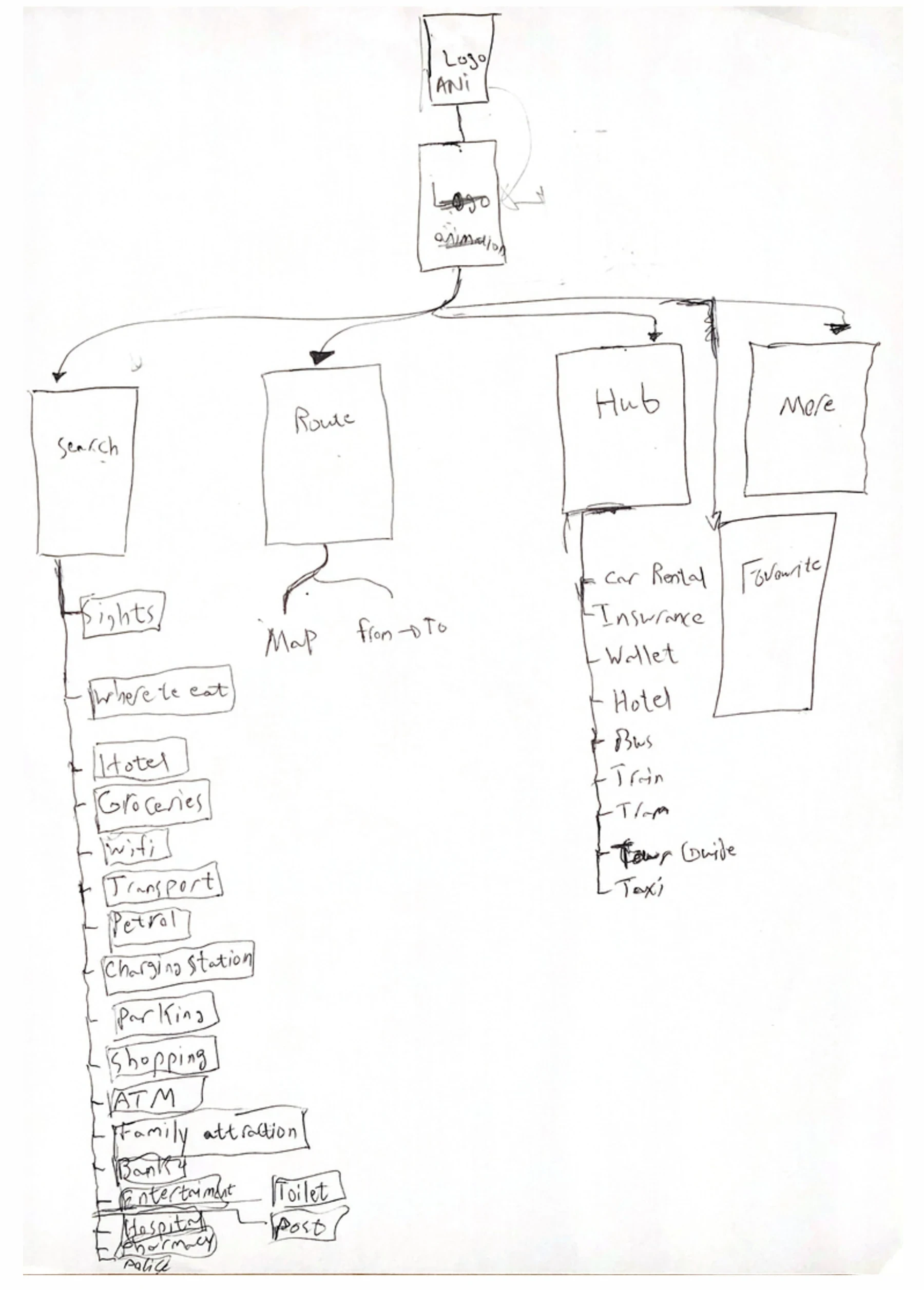
Hand-drawn navigation and low-fidelity wireframes developed into six mobile interface screens. No formal interviews or usability testing are documented.

Hand-drawn navigation and low-fidelity wireframes developed into six mobile interface screens. No formal interviews or usability testing are documented.

Hand-drawn navigation flow.

Hand-drawn navigation flow.

Low-fidelity wireframes.

Low-fidelity wireframes.

One connected navigation sequence.

One connected navigation sequence.

Splash, map, services, route entry, travel modes and turn-by-turn guidance. Select any screen to inspect its full-resolution artwork. These are proposed interfaces from the original final presentation.

Splash — proposed interface.

Splash - proposed interface.

Map home — proposed interface.

Map home - proposed interface.

Services — proposed interface.

Services - proposed interface.

Route entry — proposed interface.

Route entry - proposed interface.

Travel modes — proposed interface.

Travel modes - proposed interface.

Turn-by-turn — proposed interface.

Turn-by-turn - proposed interface.

03 / APPLICATIONS

An identity across touchpoints.

An identity across touchpoints.

An identity across touchpoints.

These applications are conceptual digital mockups, not installed signage or a launched app.

These applications are conceptual digital mockups, not installed signage or a launched app.

Conceptual wayfinding sign mockup.

Conceptual wayfinding sign mockup.

Conceptual phone mockup.

Conceptual phone mockup.

Conceptual storefront mockup.

Conceptual storefront mockup.

A visual identity built to work across touchpoints.

A visual identity built to work across touchpoints.

Explore the complete CityLook brand guidelines, covering logo usage, color, typography, iconography, signage and digital applications.

Complete original PDF page 1 of 15: Cover

Original guidelines / Cover

1 / 15

Academic concept document. Example contact information in the mockups is not professional contact information.

SCOPE & EVIDENCE

Academic concept, not a released app.

Think it through.
Make it meaningful.

Think it through.
Make it meaningful.

The projects here are academic concepts, studies and prototypes.

© 2026 · ALI AHMAD

Contact ↗

Back to home ↗